
- 1. Boost Your Blog’s Accessibility with Mobile Optimization
- 2. Organize Your Blog with a Clear Navigation
- 3. Harness the Power of User-Friendly Typography
- 4. Master Visual Hierarchy in Design
- 5. Elevate Your Blog with High-Quality Imagery
- 6. Maintain a Consistent Brand Design
- 7. Design CTAs That Get Results
- 8. Revamp Your Blog’s Sidebar Design
- 9. Boost Engagement with Smart Comment Section Design
- 10. Integrate Social Media Buttons for Engagement
- 11. Craft Eye-Catching Email Subscription Forms
- 12. Keep Layouts Consistent
- 13. Customize Design Elements for Blog Sections
- 13 Blog Design Ideas: Summary
When it comes to creating a blog, designing how exactly it looks is the most exciting part. Once you’ve laid the foundations and built your personal website template (with the best blog website builder, we hope), it’s time to get customizing.
Of course, you probably already have some idea of how you want your blog to look. But actually putting those design principles into practice can be a real challenge.
That’s why below, we’re offering up our 13 best blog design ideas to get you started. We’ll help you kickstart your imagination with some inspiration: translating your vision into clean lines and even cleaner designs that look good – and render well – on all devices.
1. Boost Your Blog’s Accessibility with Mobile Optimization
In an online space increasingly interested in inclusivity and accessibility (and rightly so!) ensuring your blog renders properly across all devices is crucial.
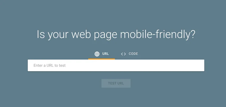
To this end, implement a responsive, mobile-first design for your blog – and here’s where CSS media queries can help. Basically, they’re lines of code that enable your blog’s layout, font sizes, and images to adapt seamlessly across various screen sizes.
Once you’ve built your blog to a responsive standard, go one step further and test it, rigorously, across different mobile devices. You can use Chrome Lighthouse to test your blog’s mobile usability.
2. Organize Your Blog with a Clear Navigation
Once you’ve got your blog firing on all devices, you’ll need to ensure it’s easy to use on all devices – and that means getting organized.
A difficult-to-use blog is like a cluttered kitchen. It’s hard to find the things you need – and it’s not a fun place to be.
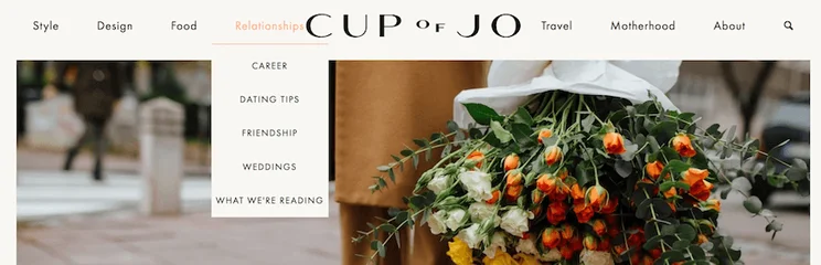
So, create a user-friendly menu to help your blog’s visitors traverse your website. Ensure it’s easy to see (which means placing it at the top of your website) and simple to select (so, none of those tiny “x” buttons on mobile that those of us with chubbier fingers can’t click).
Group related categories, and use dropdown menus for subcategories. This will ensure your blog menu is clear, and help your audience understand which topics are linked.
By arranging your blog into a well-maintained, clearly signposted hierarchy, you’ll make it easier for people to gravitate to the parts of your blog they’re most interested in – and navigate to the content they want to read most.
3. Harness the Power of User-Friendly Typography
One of the golden rules of blog design? That no matter how much you might love movies like Pride and Prejudice or Wuthering Heights, choosing typography from a similar era isn’t a good idea.
Our point? Ditch the unreadable, archaic fonts (and bin Comic Sans while you’re at it!) in favor of readable, web-safe fonts. Arial or Georgia are good choices for your blog’s body text, while clean, legible fonts are ideal for your headings.
Oh, and remember – size does matter. So utilize a font size of at least 16px for readability, and maintain a line height of 1.5.

More Information
If you’re stuck on which font you should choose for your website’s typography, check out our ultimate guide to choosing the best font for a little help!
4. Master Visual Hierarchy in Design
A blog post will catch your reader’s eye before it reaches their brain. This means that, before your blog’s visitor has read a single word, they’ll take in your post as a whole, at a glance. If it looks too complicated or cluttered, they’ll be hitting that “Back” button in double time.
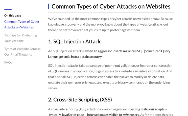
With this in mind, create a visual hierarchy in your blog posts by formatting content underneath H2s and H3s. For example:
How to Bake Choc-Chip Cookies (H1)
Method (H2)
Step 1: Preheat the Oven (H3)
Formatting your posts this way instantly lets your reader – and Google – understand the structure of your content. You can also make headings bolder and larger than regular text.
This also serves to break up your writing, making it immediately easier to digest.
To this end, scatter bullet points and numbered lists throughout your body copy to break up those text walls and do your readers’ retinas a favor.
5. Elevate Your Blog with High-Quality Imagery
As we touched on in the point above, reading shouldn’t just be an informative experience but an aesthetic one, too. (Remember how many words a picture is worth, after all?)
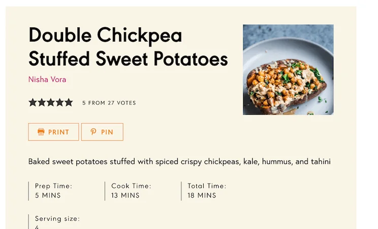
So, select high-resolution images related to your content to pepper in and amongst the words. But don’t neglect your image SEO. This means that before uploading those images, ensure the file size isn’t going to slow down your page and compress them – a tool like TinyPNG works – to help your images lose a few kilobytes before they hit your blog.
You’ll also need to ensure each image has a caption and a descriptive alt tag.
When writing your alt tags, don’t just use them as an opportunity to keyword stuff. Make sure they describe the image as much as possible. Not only does this make your blog accessible, but helps your SEO, too!
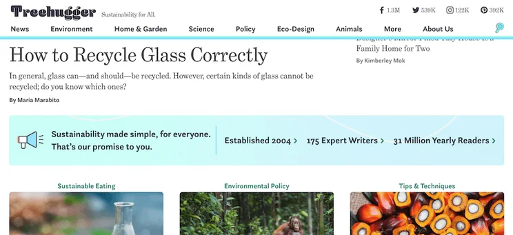
6. Maintain a Consistent Brand Design
The red and gold of McDonald’s. The green of Starbucks; the purple and orange of FedEx.
All strong brands have a strong color scheme – and that means a consistent one, too. So as you design your blog (and add to it, ongoing, with regular content), maintain a steadfast commitment to a consistent color palette, logo, and font style, too: with a standardized way of implementing brand elements throughout all areas of your website.
7. Design CTAs That Get Results
However much you love writing, you’re usually not just writing “for writing’s sake”. You’re writing to elicit a result; to get your reader to take a desired action.
To do this, you need a call-to-action (CTA).
This is the thing that will make your users do what you want them to – be that through subscribing to your newsletter, making a purchase, or simply sticking around to read more articles on your blog.
The key, though? You have to make your CTAs compelling. Concise, action-oriented, verb-heavy CTA copy – ”Sign Up Now”, “Get Started Today”, “Claim Your Free Trial” – is vital.
The color of your CTAs also makes a difference, so we recommend using different shades and hues to create an eye-catching contrast.
Placement, too, is important – and no one wants to feel like they’re being sold to, rather than engaged and informed. So pop your CTAs at the end of your blog post (or, if relevant, ensconced within the most appropriate segments of the body copy) for maximum impact.

8. Revamp Your Blog’s Sidebar Design
Earlier, we discussed your blog’s top – horizontal – menu bar, and why it’s so important.
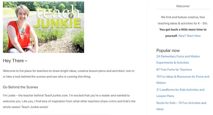
But that doesn’t mean you should forget about your sidebar – its vertical counterpart that allows your readers to access quick links.
Your blog’s sidebar should be optimized for design and functionality, which means limiting the number of widgets there. (We know, widgets are fun but sometimes, they just add clutter.)
To minimize the cognitive load your sidebar places on your blog’s readers, keep it to a brief bio, a few recent posts, and a search bar.
9. Boost Engagement with Smart Comment Section Design
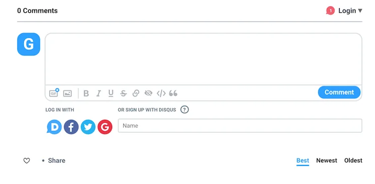
Your blog’s comments section is where your followers will come to discuss what they’ve read – and where you yourself can engage with them to boost your brand. This means it’s got to look visually engaging.
To this end, improve your comment section’s visual appeal by:
- Styling the layout to clearly differentiate between user comments and author responses
- Implementing a threaded design to display conversation starters and their replies
- Using avatars and color to create contrast and flair – and help comments stand out
- Enabling commenters to access smart formatting features, such as bold and italics
10. Integrate Social Media Buttons for Engagement
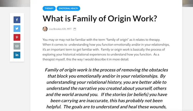
To help your readers start a conversation about your blog posts with their own network, you’ll need to make it as convenient as possible for them to quickly and easily share them with their social media connections.
To do this, add social sharing buttons at the beginning or end of your blog posts (or, as in the case of the example below, in the sidebar): utilizing eye-catching icons and colors to ensure they’re easy to spot and click.
11. Craft Eye-Catching Email Subscription Forms
Email marketing is an excellent way of staying top of mind with your audience, building your brand, and amplifying new blog posts as you publish them.
But for your emails to be successful, you’ll first need people to send them to – and that means crafting an engaging, eye-catching email subscription form.
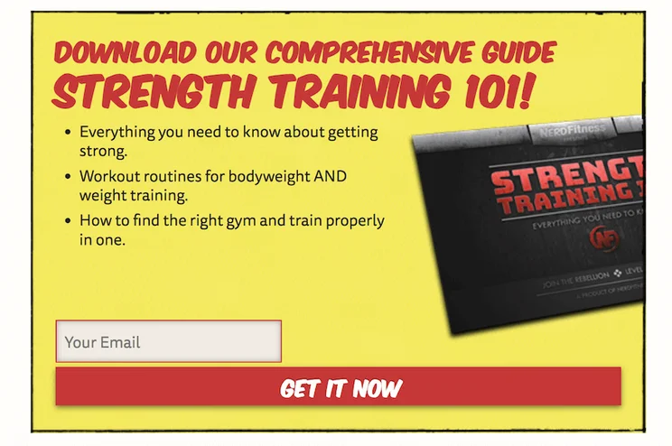
Your email capture form should match your blog’s color scheme and include a clear call-to-action; with both copy and design working in tandem to entice the user to give up their email address. Here, be sure to highlight the value they’ll get from subscribing to your email list, or – as in the case in the image below – sweeten the deal with a giveaway or gimmick.
12. Keep Layouts Consistent
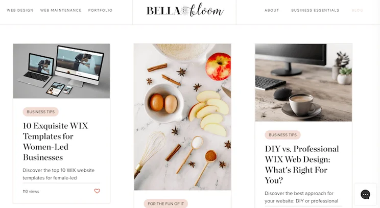
We’ve already discussed the importance of consistency where font styles, color, and brand assets are concerned. But if your blog’s layout is slipshod, that’ll all count for nothing.
Implement a slick, seamless layout throughout your blog’s pages, relying on the same font styles, sizes, and colors for headers and text, and maintaining a standard level of spacing between your blog’s sections and elements. Do this, and your blog will remain easy on the eye at both a subconscious and a conscious level, inviting the reader to stick around.
13. Customize Design Elements for Blog Sections
Blog websites aren’t just about the posts, but all that digital infrastructure that enables those posts to exist and stand out. Here, we’re talking about your home page, your “About Us” page, and your “Contact” page – to name but a few.
These pages are crucial because, often, they’re how new readers will come across your blog. They’re the window to all the juicy content within – so don’t let these pages be mere window dressing.
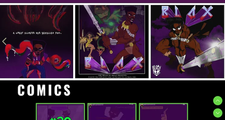
With this in mind, consider using unique headers and background colors for your homepage, and add custom graphics to your “About Us” and “Contact” pages to imbue them with their own individual character. Adding visually appealing dividers between sections is good practice from a design standpoint, too; they break up the page for your reader: helping them know where to look – and where to navigate to next.
13 Blog Design Ideas: Summary
Let’s recap the 13 blog design ideas we’ve covered here:
- Optimize your blog for mobile devices
- Organize your blog with clear navigation
- Harness the power of user-friendly typography
- Master visual hierarchy in design
- Elevate your blog with high-quality imagery
- Maintain a consistent brand design
- Design CTAs that get results
- Revamp your blog’s sidebar design
- Boost engagement with smart comment design
- Integrate social media buttons for engagement
- Craft eye-catching email subscription forms
- Keep layouts consistent
- Customize design elements for blog sections
Now, all that’s left is to do with these blog design ideas? Start implementing them!
Let us know how you get on designing your blog in the comments section below, and be sure to explore our blog formatting tips before you head off.


0 comments