
- 1. Choose a Mobile Responsive Theme or Template
- 2. Strip Back Your Content
- 3. Make Images and CSS As Light As Possible
- 4. Avoid Flash
- 5. Change Button Size and Placement
- 6. Space Out Your Links
- 7. Use a Large and Readable Font
- 8. Eliminate Pop-Ups
- 9. Optimize Forms and Input Fields for Mobile
- 10. Optimize Your Website's Loading Speed
- 11. Test Regularly
- How to Make Your Website Mobile-Friendly: Summary
In the summer of 2015, more Google searches were carried out via mobile than desktop for the first time ever – and you’d better believe they’ve only gone up since then! These days, many website builders help you build a website that’s mobile-friendly with tools and templates, but it’s up to you to make sure your pages load and look good on different devices.
If you’re reading this article, chances are you’re already aware of the importance of having a mobile-friendly website, and are looking to make sure that yours is offering a great experience to mobile users. We can teach you how to do that!
To make your website mobile-friendly, you’ll need to:
- Choose a mobile-responsive theme or template
- Strip back your content
- Make images and CSS as light as possible
- Avoid Flash
- Change button size and placement
- Space out your links
- Use a large and readable font
- Eliminate pop-ups
- Optimize forms and input fields for mobile
- Optimize your website’s loading speed
- Test regularly
What Does Mobile-Friendly Actually Mean?
When we talk about a ‘mobile-friendly’ website, we’re talking about displaying a different ‘version’ of your website to visitors viewing your site from mobile, in order to give them a better experience.
There are several ways you can achieve this:
- Responsive design – your website’s design adjusts to adapt to the screen size, whether you’re just changing the size of your desktop tab, or browsing from a mobile or tablet.
- Dynamic serving – visitors are shown a different, purpose-built version of the site, depending on the device they’re viewing from.
- A mobile app – in some cases, having a completely separate app for your mobile audience makes the most sense (although if this is the case, you should also make sure your website is up to scratch for those who don’t want to download it).
Responsive design is the bare minimum you should be aiming for, and it’s what Google recommends – not to mention being one of the main routes you can take to making your website more accessible. That said, we think it’s worth further editing your auto-generated mobile site anyway – after all, you want to aim for a fantastic mobile user experience, rather than an ‘acceptable’ one.
If you think a mobile app would work for your site, we recommend getting in touch with a developer who can help you out with that.Find Out More
Here are some other articles you might enjoy:
How to Design a Website – If you’re starting to design (or redesign!) your website, check out this article for a step-by-step guide, and key points to consider.
How to Build a Website – Haven’t made a start on your site yet? No worries, this guide will walk you through the whole process!
5 Best Website Builders for SEO – Any website builder with strong SEO comes with mobile-friendliness baked right into its templates. Here are five of the best.
Digital Marketing Tips – Keen to know more about online marketing? Check out our top tips today…
1. Choose a Mobile Responsive Theme or Template
Okay, so this is the first step, and it’s a big one: choose a mobile responsive theme or template!
Because having a mobile-responsive design is so important, it’s something that pretty much every top website builder has covered across each of its templates. For example:
Squarespace – has water-tight mobile-responsiveness, and would be our top choice if you’re building a site from scratch and view mobile experience as a top priority.
Wix – all templates are mobile-responsive, but always be sure to check in the mobile view as you go. Because Wix sites are so customizable, sometimes big changes don’t translate so seamlessly, and you’ll have to do some tweaking.
If you’re building a site using a CMS system, such as WordPress, make sure the theme you choose to build your site from is mobile-responsive – or if you’ve already built a site, switch to one that is!
Just search ‘responsive theme’ in WordPress’ own theme library, or on a third party site like Themeforest. Make sure you read reviews, and if possible, take a look at any sites that are using this theme from your mobile to gauge the experience for yourself.

Help! What if I’m on a non-responsive theme, and I can’t switch it?
If your website was built using an old, non-responsive theme or template, and you’re unable to switch it, try adding this line of code into each page’s <head> tag:
<meta name=”viewport” content=”width=device-width, initial-scale=1.0″>
This means your pages should automatically reformat to fit the width of the device, switching from a landscape style to portrait.
2. Strip Back Your Content
You’ve chosen a lovely responsive theme or template, so now you’re all set, right? Wrong!
Switching to the right template or theme is a big step, but it’s only one of several you should take to perfect that mobile experience.
Now, it’s time to take a look at the automated mobile view of your website and strip it back:
Distill Your Offer
Work out the main goal of the page you’re on, and don’t hesitate to make this a lot more prominent on your mobile version.
Take a look at this example from Trainline:

The homepage is designed to encourage users to search for train tickets, and this form takes center stage on the mobile version. On the desktop version, this would seem too pushy, but on a mobile version, it works.
Avoid Large Chunks of Text
The copy on your website should be short and sweet at the best of times (with the exception of blog posts, like this one!), but on mobile this becomes all the more important. Take a read over our tips for writing for the web, and take your virtual scissors to any long chunks of text.
Shorten Forms
Filling in long forms is a chore at the best of times, but on a mobile? On the move? Forget it! Long forms will lose you readers faster than you can say ‘this is a required field’. Make sure every form you’re displaying on mobile is only asking for information that’s absolutely essential.
Top tip! Pesky autocorrect is a surefire way to turn form-filling into a major waste of time. Save your readers the stress by switching it off. If you have access to the code of the form, make sure the autocorrect field is set to autocorrect=off.
3. Make Images and CSS As Light As Possible
Making your website as light as possible is always a good idea – but what exactly does that mean? Well, each element on your website carries a virtual ‘weight’ – whether that’s a video or an image which has a file size, or code which needs to be loaded each time the website is clicked on.
Google has been very clear about the fact that website speed is a crucial ranking factor, meaning slow (a.k.a. ‘heavy’) websites will lose out to the competition on the search engine results pages (SERPs).
When it comes to mobile, this is all the more important. If you’ve ever tried to load a webpage somewhere remote, only to watch each element fall into place painfully slowly, you’ll understand why.
So, what can you do about it?
Compress Your Images
When you’re uploading any image to your site – mobile or desktop version – it’s vital that you optimize images by compressing them. You do this using a free online tool, such as kraken.io. This greatly reduces the file size of your images, without compromising on the image quality.
Host Your Videos with a Third Party
By uploading your videos to a third party then embedding them on your site, it means the virtual ‘weight’ of these videos is largely kept to that chosen site, rather than to yours.
Wistia is a popular platform for this, but YouTube also works – you’ll just want to make sure you’re switching off autoplay, so that an unrelated video doesn’t play after yours. To do this, simply:
- Go to your WordPress page or post
- Find the embedded code and click on the ‘text’ tab
- Find the part that says src=”youtubeurlhere”
- Add ?autoplay=0&rel=0 after youtubeurlhere
- The code should now read src=”youtubeurlhere?autoplay=0&rel=0″
- Hit ‘Update’ and you’re good to go
You can also optimize videos for your website to keep things running quickly and smoothly.

Top tip! If you don’t think your content would go down too well on YouTube (some videos don’t make a lot of sense without the context of a full page), make sure you set the visibility to ‘unlisted’. That way, nobody will stumble upon it anywhere but your website.
4. Avoid Flash
Flash is often used to create animations, but it generally isn’t supported by mobile devices, so is best avoided altogether.
Top tip!Instead of using Flash, consider utilizing modern animation techniques like CSS or JavaScript animations to add visually appealing and interactive elements to your website.
5. Change Button Size and Placement
Pretty much every website uses buttons to link through to other sections, or to forms. But a ‘good’ button can quickly become a ‘bad’ button on mobile if it’s in the wrong place, or is the wrong size.
Think about how you hold and use your phone. Chances are you’re using your thumbs for pretty much everything, meaning anything you can’t reach with your thumb becomes a total pain.
Here’s where you should aim to place calls to action (CTAs) on a mobile site:
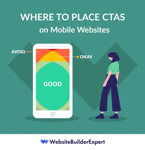
So now you’ve got your buttons in the right place, it’s time to make them the right size. That generally means you’ll need to enlarge them a little – it’s a lot harder to click accurately with a thumb than with a mouse, after all.
Top tip!Check your button placement on a mobile device, as placement can change when switching between desktop and mobile. This can lead to buttons being placed away from the content they are linked to.
6. Space Out Your Links
Speaking of how hard it is to click accurately with a thumb as opposed to with a mouse, that brings us nicely onto our next point: look at your links!
More specifically, you’ll want to check that any hyperlinks on your mobile site:
- Aren’t too close together, to avoid people clicking on the wrong one by accident.
- Link out to pages which are also mobile-optimized for a seamless user journey.
Top tip! Use a broken link checker to ensure all links on your site are leading to where they are supposed to!
7. Use a Large and Readable Font
It’s recommended that you use a font size of at least 14px on desktop, but make sure you test out how it looks on your mobile version – chances are you may find it shows up a little small, and you’ll want to bump it up a bit.
Double check the readability of your font, too. It’s one thing to try a more experimental font on a desktop, but this move is unlikely to pay off on mobile. That said, you’ll want to keep fonts as ‘on brand’ as possible across all platforms.
When working on a mobile view of your site, you’ve got a much smaller area to play with. On a desktop, you can space out text with line breaks and images. On mobile, try bolding or capitalizing different lines of text instead to stop them from merging into one another.

Top tip! You may even consider removing non-essential text from the mobile version of your website to ensure a better user experience.
Find Out More
Need a hand choosing the perfect font? Our guide of the Best Fonts for Websites shortlists our favorite typefaces, with tips for picking yours.
8. Eliminate Pop-Ups
When used carefully, pop-ups can work really well on a desktop version of a site. You might have noticed they’re something we use on quite a few pages here on WBE.
But when it comes to mobile, pop-ups are best avoided. Not only do you have a smaller screen to deal with, but you can’t tailor the pop-up to trigger at key moments, such as when the user goes to exit your screen.
Top tip!If you just have to use a pop up on the mobile version of your site, ensure that the close and action buttons are visible and easy to select when viewed on a mobile browser.
9. Optimize Forms and Input Fields for Mobile
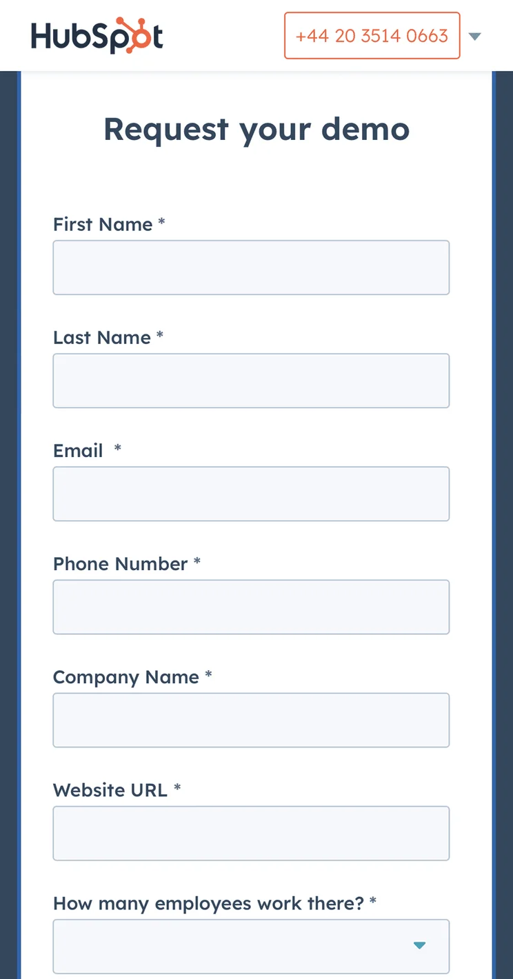
Filling out forms on mobile devices can be tricky when they aren’t optimized. This often leads to frustration and failure to complete. For many businesses, this can be devastating as valuable actions such as contact forms, lead generation forms, and even checkout pages are left abandoned.
Here are some best practices for ensuring forms work well on mobile devices:
- Reduce the number of fields (if it isn’t essential, lose it)
- Utilize input masks and auto-fill options to help speed up the processes
- Provide clear error messages and validation feedback to help users identify where they have gone wrong and where they have input information correctly.
Top tip!For each field you include in a form ask “do we really need this information?” In many cases just an email and first name is enough to complete a process.
10. Optimize Your Website's Loading Speed
Website loading speed has a huge impact on user experience and your search engine performance. After all, nobody likes to wait an eternity for a webpage to load.
You can check your website load time using free tools such as Google’s PageSpeed Insights. If you find they are a little slow, here are some tips to help speed things up:
- Compress all the images you use, you can use a free online to do this
- Enable browser caching
- Minify CSS and JavaScript files
Top tip!If you follow the advice in this section and till find your website is loading slowly, talk to your webmaster as there may be something that needs to be changed in the configuration of the site such as the removal of plugins or switching your host.
11. Test Regularly
The best way to find out how mobile-friendly your mobile site is is to test it! You’ll want to do this in three different ways:
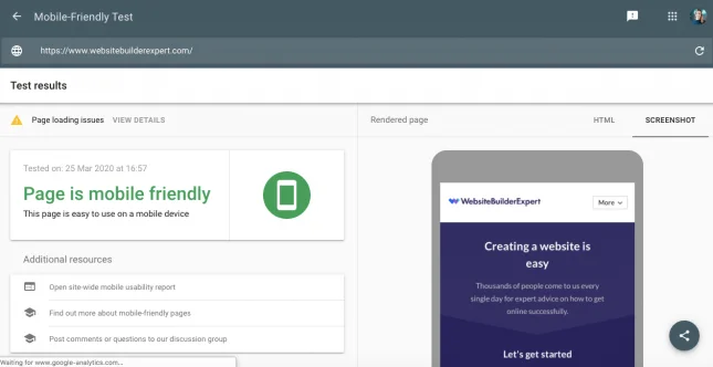
Run URLs Through Google’s Mobile-Friendly Tool
Google has a free mobile-friendly testing tool, which anyone can use to test how mobile friendly any given URL is – whether that’s a homepage (as below), or a page within your site.
Try Out Different Device Sizes from Your Desktop
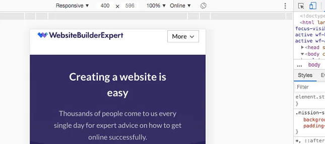
A great way to check how responsive your site is is just to play around with the shape of the tab of your website that you have open. As you reduce the width of your tab, you should notice your site start to ‘contract’ and morph into the more mobile-friendly version.
To quickly test the look of anything on mobile, you can also right click on your webpage, select ‘Inspect’, and then click on the icon of two screens that appears in the toolbar across the top:
Top tip!Set a reminder to test your website regularly. How often you do this will depend on how often you publish new content or make website updates. For most, once a month would be fine.
How to Make Your Website Mobile-Friendly: Summary
Thanks for sticking with us as we explained how to make your website mobile-friendly. Here’s those steps once again:
How To Make Your Website Mobile-Friendly:
- Choose a mobile-responsive theme or template
- Strip back your content
- Make images and CSS as light as possible
- Avoid Flash
- Change button size and placement
- Space out your links
- Use a large and readable font
- Eliminate pop-ups
- Optimize forms and input fields
- Optimize your website’s loading speed
- Test regularly
The good news for most sites is that the bulk of the hard work will likely be done for you by your theme or template. That said, we think it’s worth making the extra tweaks outlined above to ensure your mobile users are getting a brilliant experience, rather than an acceptable one. After all, the stats say they’ll likely make up the majority of your users!
More information
- Want more information on designing mobile optimized websites? Check out our step-by-step guide on mobile-first design
- Want more design tips? Find out about dynamic content and how to use it
- Learn how you can use optimize voice search for your website and mobile users


1 reply