How To Choose An Eye-Catching Website Color Palette

We may receive a commission from our partners if you click on a link and purchase a product or service on their website. Learn more

jac
Written By
Updated on May 11, 2023

Visuals do matter with website design, whether you’re building your site from scratch, or are rethinking the palette of your website, this guide will help you choose a color for your website.

After all, color is a massive aspect of branding. Ever noticed that almost every fast food restaurant uses red and yellow in their logos? That’s because together, these encourage hunger and friendliness. But picking a color palette for your website means understanding one thing:

What do you want your brand to say?

Colors are integral to web design and can trigger certain feelings on sight. There is a lot behind color psychology – you might be surprised to hear that 85% of people claimed that color has a major influence on what they buy.

When some companies experimented with their button colors, they noticed a sharp uptick or decline in their conversions. For example, Beamax, a company who makes projection screens, noticed a gargantuan 53.1% increase in clicks on links that were red vs links that were blue.

And that’s not just clicks – a study run on the mental impact of colors found that colors boosted brand recognition by an average of 80%. For example, think of Coca-Cola, and you’ll likely picture their vibrant red cans.

Don’t take this to mean that red is king! If your site is mainly red, a red call to action won’t stand out. So you’ll want to create a cohesive color palette and find a combination that works for your brand. With that being said, it is important to understand the concept behind asymmetrical balance, and how to contrast pieces of your site.
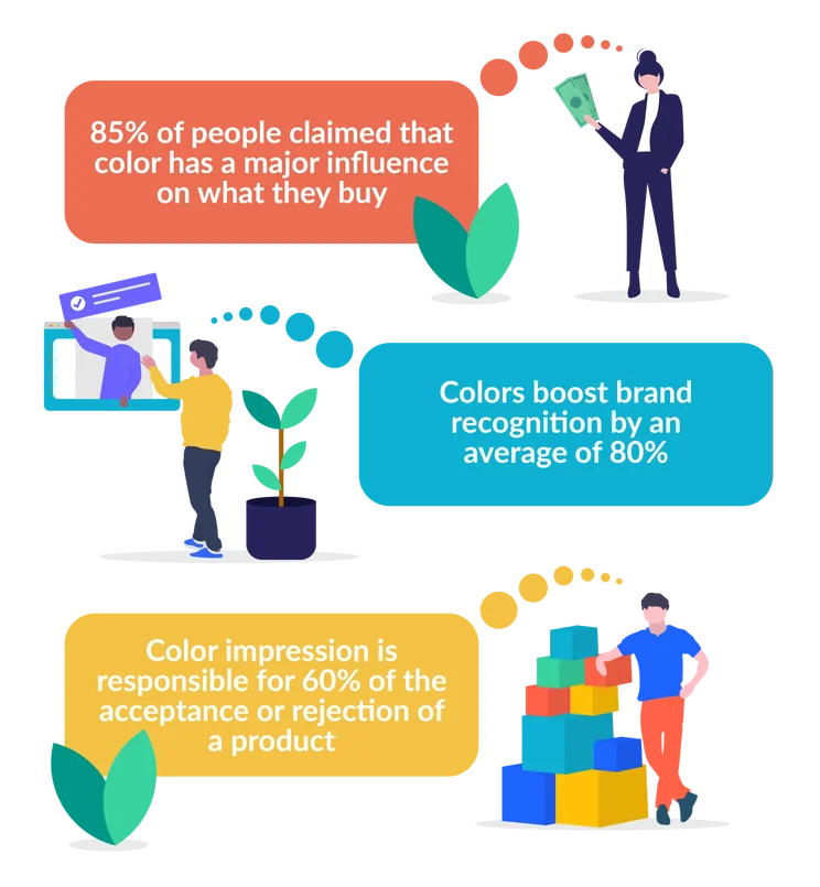
Graphic of statistics with little images of people next to them
Sources: Truelist, Business Insider, Reboot Online

So how do you find one that works for you? You first need to get a good understanding of what you’re selling/providing. If you’re trying to achieve a more premium, high-end image, then black represents elegance, as people associate it with high quality, and intrigue.

However it really depends on what you’re selling or marketing, black may be elegant but might not express the fun and joy of orange. If you’re a tech company you might want blues in your palette as they represent security – just think about some of the big bank or tech companies like Facebook. Website colors really do say a lot about what you have to offer, so let’s take a look at each color more in-depth:
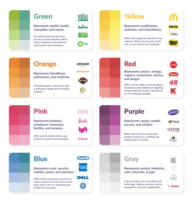
Graphic of different colors and logos for businesses with that color
Colors highlight what a brand represents to consumers.

It’s an idea to think of your consumers and how your logo and marketing will affect them. Colors have environmental, psychological, and sociological representation. Whether for example, that’s nature’s emerald greens or societies money connotations. These will have subtle influences on those that visit your website or browse your social media.

Learn more about Website Color Theory and how to apply it yourself, in our separate guide to help you understand the principals behind your color palette.

Choose a Primary Color: Understanding What Colors Represent

The best way to decide on one or two main primary colors is to think about the vibe of your product or service, and discover colors that fit your brand vibe to find one you like. Here’s a look at what colors represent and how they might fit your business:

Red

  • Think brands like Coca-Cola or Nintendo.
  • Emotionally represents urgency, lust, excitement, energy, and love.
  • Digitally creates a sense of urgency, or draws attention to areas of a website.
  • Branding works with energy drinks, food, sports, marketing, and emergency services.

Yellow

  • Denny’s or McDonalds.
  • It psychologically represents happiness, the sun, laughter, optimism, creativity, playfulness.
  • Digitally yellow can create a sense of energized happiness if a bright yellow is chosen, otherwise softer yellows have a more calming sense.
  • Branding color works with “junk food”, creative portfolios, game companies, cartoon networks, kid’s products, and Swedish furniture companies (IKEA).

Green

  • Whole Foods or Animal Planet.
  • Green gives the psychological impression of freshness, nature, money, relaxation and sustainability.
  • For websites and branding green offers a sense of new beginnings, wealth, and trustworthiness.
  • It does particularly well for travel websites, tourism, medicine, organic produce, environment sites, and even store builders like Shopify.

Orange

  • Businesses like Nickelodeon or Fanta.
  • Orange is the color of psychological warmth, ambition, and infectious enthusiasm.
  • Websites and branding that incorporate orange tend to display entertainment media or share a warmth or excitement about the products they sell.
  • Orange excels in the soft drinks area, but also does well for cartoon networks, chocolates, phone networks, and the likes of FireFox web browser and Amazon delivery.

Blue

  • Walmart or American Express.
  • Blue implies psychological dependability, wisdom, loyalty, and reassurance.
  • What that translates to in the digital sphere is a website that is good in security and inspires trust.
  • The sites and brands that tend to use them are information sites (like us!), high-tech, banks, social media brands, and even toothpaste.

Purple

  • Hallmark or Cadbury.
  • Psychologically purple is a royal color, one steeped in sophistication, mystical wisdom, and spirituality.
  • It implies a distinguished brand that has a history of quality.
  • Brands that have been known to use it are postal services, spiritual gurus or blogs, chocolate businesses, and even Twitch streaming.

Brown

  • Nespresso or M&M’s.
  • Brown psychologically represents earth, roots, down-to-earth, honest, friendship, and comfort.
  • In the digital world, it represents a reliable product that can be used by anyone.
  • It’s usually adopted by brands of cholocate, coffee, or parcel delivery. It can also work well for organic or nature-centered businesses too.

Black

  • Chanel or Adidas.
  • Psychologically black is sturdy, timeless, classic, powerful, authoritative, and can even represent death.
  • Black is usually associated with luxury items or elegance, think your really big brands that sell high-ticket items, cars, phones, and clothing.

White

  • Apple or Nike.
  • The color represents in the mind; purity, clinical, spaciousness, simplicity, and virtue.
  • White is sleek and usually has user-friendliness in mind. Think doctors’ websites, high tech, cars, and high fashion.

Find Out More:

Once you have a primary color in mind, it’s time to choose the other colors that will compliment those colors. Every color has a counterpart that makes it “pop,” and these are known as color compliments.

For example, a red circle on a green background pops a bit more than a blue circle on a green background. But a blue circle will look a lot better and more obvious on an orange background.

So if you’re using a predominantly green website, it’s a good idea to implement red calls to action, or use red to highlight important features that you want to catch the eye of any readers.

Try to only have one or two colors on top of your primary color. More than that, and your website could become messy. The known max is four to five colors. Nothing will stand out well if you inundate visitors with loads of different stimuli. However, bare in mind, when it comes to promotional materials or extras like icons, you may need those extra colors to help convey different icons meanings. 
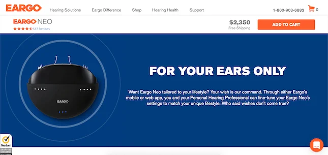
Eargo Color

A good example of using additional colors is from the hearing aid brand Eargo. It has a main color of orange, so it’s used this duller blue to highlight this important section of its website. From what we know about color compliments, we can see how this blue and bright orange contrast against each other. The orange also makes important elements pop, like the “add to cart” button and the logo.

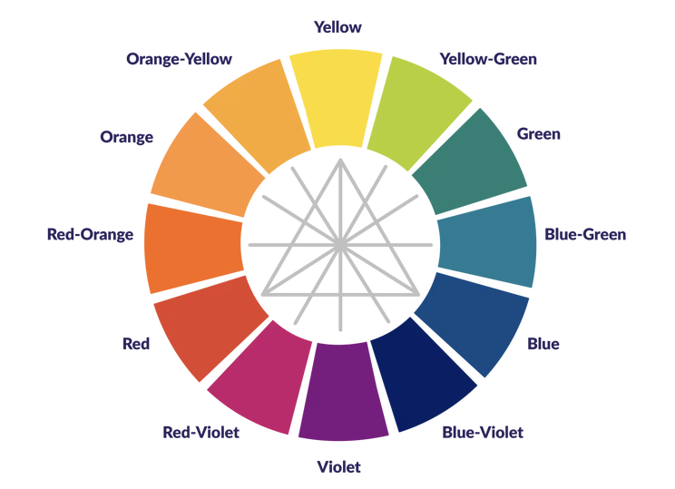
Using a color wheel will help you find color that work together. Complementary colors are located directly opposite from each other, and the three primary colors are on the triangle points.
Choosing good colors for a background is an important choice, as the background of your website is theoretically going to take up the most space. It may seem simple to make it white, but you really need to think about your branding and the feeling you want to convey.

You can go for a more muted version of your primary color in order to solidify your branding. This will require a white or grey overlay on the background in order for text to show up.

Alternatively, you could just have the whole website be an off-white color, or beige color, which is the more common choice. It’s inoffensive, and won’t stop text, images, or links – from jumping off the page.

WBE Background

Look no further than our own website to see what a blank, gray background can highlight.

The final stop on your colorful journey is to nail down a font color. Once you’ve decided on the best font for your website, the color of your text is key. You might go for the easy choice and choose black, but have a browse around the internet, and you’ll find that purely black typefaces aren’t as common as you’d think.

A black typeface on a white background can lead to eye strain, as there’s a 100% contrast – and people will be more likely to click away if your website is difficult to read.

While explicitly colored typefaces should be reserved for links and important bits of information, you can use gray or gray-tinted color to give your website a softer, more inviting look.

There hasn’t been a ton of experimentation in using colored font on websites other than in promotional pop-ups or logos, but that doesn’t mean you can’t! We would just recommend proceeding with caution as it might make it harder to read.

Website template with a pink background and red text
This Squarespace template for creative field careers uses bold red font.

Here’s an example of a Squarespace template that uses colored font in an appealing way. We’d say if you work in a creative career, experimenting with bold colors will come across as more natural than if it were a tech company website for example.

If you want a quick and free tool to help you choose your palette we cannot recommend coolors enough really. You go to the website and you can add the hex code of a color you like, and then hit the space bar and this nifty tool will show you colors that compliment it. Or it shows you entirely new color palettes if you don’t click the padlock on any color!
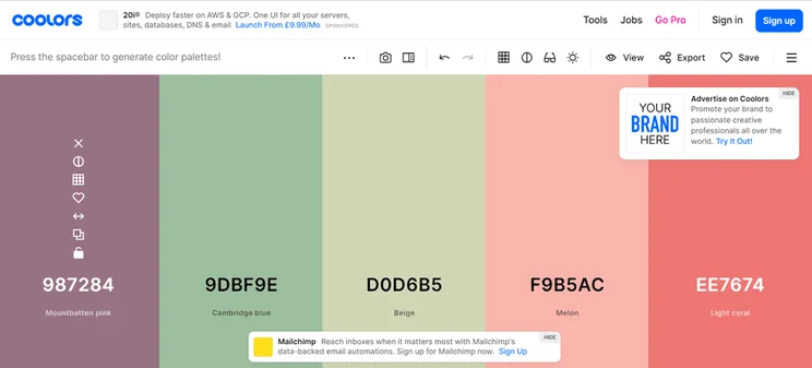
blocks of color next to each other one has a padlock above it
This tool shows you different color combinations that work well together.

We recommend finding one or two color that really represents your brand, and then using this tool to find any additional colors. Also remember to write down or save your hex codes, which are the numbers associated with color as that will help you create promotional materials and your website.There’s also Color Safe, another website that lets you generate and browse colors by type, allowing you to find that perfect red or green.
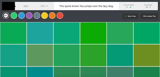
Color Safe

Once you’ve formulated a palette, you can also input individual colors on Color Space to analyze whether there are more effective color schemes out there. What’s great about this tool is the ability to also check color gradients by adding two colors and selecting different arrows to see what a gradient design looks like.

By now, you’ll have a sense of what kind of color your website will be using. Here are a few additional tips for when you’re considering colors.

Use Consistent Saturation

One thing you can do to strengthen your brand is to use various colors with a similar saturation. Saturation is another way of saying a color’s brightness. Have a look at drink company Innocent’s usage of color:
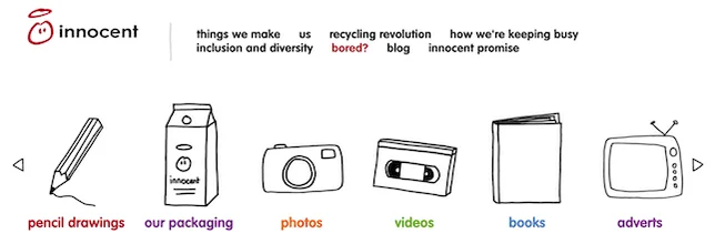
Innocent Color

Here they have six different colors, but none of them feel out of place or jarring. That’s because their saturation is muted to the same level, making it feel consistent.

Vary Saturation of the Same Color

When a brand has a strong connection with a certain color, they might not want to branch too far from it. However, everything being a single color can become a bit stale, so it can be fun to take your primary color and play with the saturation a bit. Have a look at the social media options in the bottom left of this TechCrunch article.

TechCrunch Colors

All five of them are a similar green, but have varying levels of brightness. These vary up the visuals of the page, while also reinforcing the idea that a lighter green is synonymous with TechCrunch.

Whether you’re choosing color for a new website or for website re-design, here are the steps you’ll want to take when picking colors for your website:

  1. Choose a primary color: Pick a color that suits the energy of your product or service.
  2. Choose your additional colors: Pick one or two additional colors that complement your primary color, ideally colors that make your primary color “pop.”
  3. Choose a background color: Choose a color for the background of your website – possibly less “aggressive” than your primary color.
  4. Choose a typeface color: Choose a color for the text that is going to be on your website – remember that a solid black typeface is rare and not recommended.

And don’t be afraid to use different resources online to find your perfect color combo – there are plenty around to sink your teeth into!

Certain colors work better depending on what your site is trying to achieve. For specific branding tips, you can check out some inspirational brand strategy ideas. Or see our article for how to design your site to get started on website design.

Written By

jac

Hi, I’m Jacqueline:

I’m a writer at Website Builder Expert, having joined the team in March 2022. Before joining I had my own freelance content writing business and now I work to test builders and write the content you read here on the site – so you can create a website that best suits you and your needs. 

Over my first year here I’ve tested all the builders you’ll read about, shaped the weekly newsletter content, written social media content, and scripted YouTube videos. I’ve created demo websites like this Lucy’s Cupcakes one, to help showcase the builder’s capabilities so you can pick the best option. 

I’ve also had the wonderful opportunity to pitch articles for the site like the Best Writer Websites and write for other sites like Startups 100, and Digital Information World using my degree expertise in Film to share tips on video optimization.

You can find me on Linkedin hereJacqueline began her career at Career Karma, nearly three years ago, learning about copywriting, SEO, and helping people to gain the skills to get tech careers. She then progressed to her own freelance business, and over the years has published for a number of sites like Wellbe and Epsychonline, to name a few.

Her certifications include SEMrush Keyword Research certified, Marketing Copy, Digital Marketing, Email Marketing, and a BA (Hons) in Film and Television Production. All of which help shape the content she produces.

Since arriving at Website Builder Expert, Jacqueline has tested every website builder and ecommerce platform we review on-site. In less than a year, Jacqueline’s completed a YouTube marketing course, interviewed around 300 business owners, and attended events such as the eCommerce Expo. There’s nothing Jacqueline loves more than helping people get online – as it’s been her personal key to success. 

She’s constantly researching the latest marketing techniques and business tips for Website Builder Expert readers. Jacqueline blends her creativity with Website Builder Expert’s methodology-backed, systematic research to bring readers the most accurate and tailored recommendations.

Keep your eyes peeled for her articles below, and feel free to reach out in the comments section, where she’s happy to help you with your website questions.

More about

167 comments

Your email address will not be published. Required fields are marked *

  • Evelyn

    Very informative article.

    1 reply

    • Holly Choules
      Holly Choules

      Hi Evelyn,

      I'm so happy to hear that you found this article informative.
      Since you liked this piece, you might find our article on color theory useful too!

      Wishing you the best of luck with your website.
      All the best,
      Holly.

  • Ibrahim

    Hello,
    Well done! You have given an insightful reading into the world of website development

    1 reply

    • Lucy Carney
      Lucy Carney

      Hi Ibrahim,
      Thanks so much for your comment! I'm so glad you enjoyed the article.
      Take care,
      Lucy

  • R.S.

    sad to see checkmycolours is discontinued. any others you recommend?

    1 reply

    • Jacqueline Renouard
      Jacqueline Renouard

      Hi,
      Oh my! I'm so upset by this as I loved that tool. Thank you so much for the heads up and I will change this and search for a similar tool, keep your eyes peeled on the article to see if I can find one.
      Warmly,
      Jacqueline

  • Graeme

    Thank you for this great information

    1 reply

    • Emma Ryan
      Emma Ryan

      Hi Graeme,
      Thanks for commenting! We're so happy to hear you enjoyed the article. If you're interested in the topic, we'd recommend checking out our guide on the best fonts for your website as well!
      Very best,
      Emma

  • TJ

    Thank you so much for this article!

    1 reply

    • Samuel Jagger
      Samuel Jagger

      Hi TJ! Thank you for your comment. We're glad you enjoyed it and that we could have helped on your online journey. All the best - Sam

  • Isaac

    I learned a lot from this article, great work.

    1 reply

    • Lucy Carney
      Lucy Carney

      Hi Isaac,
      Thanks for your comment! I'm so glad you found it useful, have a great day!
      Best, Lucy

  • Nya

    I'm short of words like it's my first time going through this site and i must say it's good and i will encourage others to have a glance at this GREAT JOB!!

    1 reply

    • Jacqueline Renouard
      Jacqueline Renouard

      Hi Nya,
      Thanks for your comment and all the best!
      Regards,
      Jacqueline

  • Albert

    Another important facet of a website is that you want to be easy to read and obtain information from your website. If the character of the word is too light or small. It is very hard to read. Because most IT experts are young people, there is no problem for them to read. but it is hard for people 50+ to read. You know now baby boom still is a large group of population and they are now all 50+. The website should be easy for them to read. Thank you. Great article.

    1 reply

    • Jordan Glover
      Jordan Glover

      Hi Albert,
      Thanks for your comment, we couldn't agree more! In fact, in our article on choosing the right font for your website, we discuss just how important it is to make sure your website is readable, especially if you want to deliver a good user experience!
      Regards,
      Jordan

  • sizandotme

    This is awesome!

  • Andy

    I really wanted to make my site myself - taking into account my preferences. But I also wanted the design of my site to appeal to visitors. I have tried many patterns and combinations. Thanks for your advice guys! With this article, I found a solution that I really like!

    1 reply

    • Jacqueline Renouard
      Jacqueline Renouard

      Hi Andy,
      Thanks so much for your comment, we're so happy to hear that you found the right color scheme solution!
      Warmly,
      Jacqueline

  • narender

    Thank you for this detailed guide. its a lifesaver

  • Dexter

    This website is easily one of the best websites on Web Design available.

  • ezra

    Connie! This is one of the best online articles in any category I have ever read. You have presented this information in an incredibly easy way to digest and the intelligent and unobtrusive way you weave in links to other services that absolutely complement your content is BRILLIANT!! Plus this totally helped me!! Thank you and I wish you continued sucess! Ezrasvoice

  • Bakhir

    Thanks so much! I changed my whole website about 3 times already, doing it for the fourth time now lol. This will definitely help!

  • Patrinne

    Brilliant article! Thankyou SO much! Can't wait to read other articles you've written.

  • Renatas

    What a useful guide! WOW x 10! It's an alma matter of web design.

    I discovered your guide when searching for tips on how to hire a web designer. By now I've read multiple articles on your site and they all are gold. They put me on the right track how to write a proper job description and what requirements to set.

    Connie, thank you so much!

  • Chamil

    Really helpful article! Will share this with my collegues.

  • RONALD THAOFIC

    Very good. Very good article. I liked it very much and very well structured and clear. It has served me a lot.

    Thank you very much.

  • Salah

    Connie you are a genius! can't thank you enough .

  • Reaper

    hi!
    thanks for this article it is very cool

  • Sodiq

    Thanks very much. this really helpful, I really appreciate.
    kudos!

  • valerie

    I love this article, it is so helpful to me, thanks for the tips

  • Salvador

    Very useful! I loved it and I recommend a lot for everyone because as a beginner, with this post I can feel like a almost pro! Thanks !!!

  • Biwa

    Wow! Thank you so much.

  • Olena

    Thank you!

    1 reply

    • Lucy Carney
      Lucy Carney

      Hi Olena,
      So glad you enjoyed the article and thanks for your lovely comment!
      Best, Lucy

  • Romona

    Love your articles. They are so useful. I find myself reading nearly every article because they are super relevant and helpful.

  • cinnamon

    very useful content!

  • Albert S. Sandoval

    Very useful and amazing content.

  • reza rajabpour

    The content on this site is very good I would always follow it

  • Animesh

    Great guide to choosing a color scheme, with even better examples.

  • Sol

    Great Article. Love it.

  • Lindsay

    This article was amazingly helpful - thank you!!! very detailed and well explained.

  • Mustafa Amiri

    It is Amazing, really helped me in color choosing process for my website

  • Tracie

    This information was EXACTLY what I needed. I have been stressing about the colors of my website for quite some time. Now, I have a formula to use in the future.

  • Inti

    Very useful.... Thanks a lot for giving such a great information....... Wonderful ????

  • Aminat

    This no doubt was very helpful..thanks

  • Jimmy

    Very nice. I've enjoyed it! I'm new to web design but not new to coding. But I preffer more creative part. Thanks a lot. ( :

  • Vivek

    Thank you for this guide, I will be putting this into practice right now.

  • Pawan

    It really helps me to get the knowledge of choosing colours as I am always bad in choosing colours for websites.

  • Hud

    Wow this is a wonderful article. It really helped me for my Web design practical... Thanks a lot. Do you have a YouTube channel?!

    1 reply

    • Dan Barraclough
      Dan Barraclough

      Hey Hud!

      So glad you enjoyed the article, and yes, we have a YouTube channel! Please feel free to subscribe and watch our videos!

      Dan

  • angel

    Amazing content. Really amazing. Thanks. Helps a lot.

    1 reply

    • Lucy Carney
      Lucy Carney

      Hi Angel,
      Thanks so much for your comment! So glad it helped,
      Best, Lucy

  • Laurent

    Very great guide, thank you.

  • Harsh Chopra

    Very Interesting and informative article. What fee do you charge fro consultations?

    1 reply

    • Lucy Carney
      Lucy Carney

      Hello,
      So glad you found the article useful! Unfortunately we don't offer consultations - hopefully our articles and reviews can be of help, but if you want a personalized consultation you'll need to look elsewhere. Do let us know how you get on with your project though!
      All the best, Lucy

  • opy

    Very informative for newbies designer like me. thanks a lot

    1 reply

    • Hannah Whitfield
      Hannah Whitfield

      Hi Opy,

      Thanks for your comment, and good luck with your designs!

      All the best, Hannah

  • Jeffery Clanton

    I'm really surprised at the information in this article. I came in with zero knowledge and feeling very unsure. Now I'm walking away with notes and a great bit of confidence in how to approach choosing colors for websites. Thank you and great job!

    1 reply

    • Charlie Carmichael
      Charlie Carmichael

      Hi Jeffery,

      Thanks for your comment. We're happy to hear you found the article so useful. Best of luck!

      Charlie

  • Nas

    Hi

    Very impressed with article .
    Any colour recommendations for an interiors ( curtains and blinds ) business .

    Thanks

    1 reply

    • Charlie Carmichael
      Charlie Carmichael

      Hi Nas,

      Thanks for your comment. We'd recommend light colors such as pale blue as it gives customers a sense of calmness and simplicity. Hope that helps!

      Charlie

  • Deborah Ann Davis

    Excellent info! Thanks!

  • Arusyak Karapetyan

    Very useful!!! Thank you!

    1 reply

    • Charlie Carmichael
      Charlie Carmichael

      Hi Arusyak,

      Thanks for your comment, we're glad you found it useful. Feel free to share the article on your social media - you never know who else it may help!

      Charlie

  • Naman Modi

    Nice post. I was checking constantly this blog and I am impressed! Very useful information particularly the last part I care for such info much. I was seeking this particular information for a long time.

    1 reply

    • Charlie Carmichael
      Charlie Carmichael

      Hi Naman,

      Thanks for the feedback. We're glad you found what you were looking for! Feel free to share this article on your social media - you never know who else it may help.

      Charlie

  • Andy

    Highly impressed with the way you explain each and every thing in detail many of my concepts are clear after reading your awesome guide Very informative.

    1 reply

    • Dan Barraclough
      Dan Barraclough

      Hi Andy,

      Thanks for the positive feedback - feel free to share our articles on social media!

      Best,
      Dan

  • Aung Naing

    Thanks! Very helpful

  • Ahmed Ghozia

    one of the most awesome complete simple articles I had ever read about a topic.

  • Pavanne

    I must have read 30 articles about website colours and this has been the most helpful. Thank you so much!

  • Seng

    Fantastic article. Enjoyable & very useful read. Just as perfect as a beautifully matching color theme.

    1 reply

    • Charlie Carmichael
      Charlie Carmichael

      Hi Seng,

      Thanks for your flattering comment. We'd love it if you shared the article across your social media - the more people we can help the better!

      Charlie

  • Soly Hanna

    Thank you for brevity of presentation!

  • Naveen Kumar

    Choosing the right color for your website is really a big deal and only a expert web designer can make the right decision because it should create nice look and feel for the customers to browse throughout our website. Recently I went through Dezvolta's website and I was inspired by the colors they have used to design their website.

  • Simon Saidi

    Great article!

  • Jamie Przybylski

    Very helpful, thank you!

  • Jacques

    Thank you for your articles. I find them useful and with lots of interesting facts.
    HOWEVER I am a bit disappointed by your bias towards only online web-builders.
    As your appealing to the whole spectrum of website designers I would have expected (hope for) a bit more attention for the very good "not-online" (and much more flexible) web design programs.(Magix-Xara, Wesite X5 Pro etc.)

    Unfortunately it creates the impression of commercial interest in promoting online websbuilders, especially Wix.
    Actually I have a WIX subscription, but prefer to use Webste X5 for its flexibilty and pro templates. Plus that am not dependent on online providers. The final product is mine forever.
    Jacques

    1 reply

    • Charlie Carmichael
      Charlie Carmichael

      Hi Jacques,

      Thanks for adding to the conversation. We're yet to branch out into the field of offline web design programs as they limit the work you can do on your website to just one computer and tend to be more complex to use, which doesn't suit non-tech savvy folk. It's definitely an area we may explore in the future though and you make some great points about their flexibility.

      Thanks,

      Charlie

  • Alan

    Owe My ... Speechless .. This is an unbelievable article ! Clear, condensed and chock full of information. Thank you so much!!

    1 reply

    • Fred Isaac
      Fred Isaac

      Thanks Alan, glad we could help!

  • Les K

    Thank you for.that very educational article.It was a toss-up on a few colour combinations for my educational website esl.mobi

    I ended up using a heart as the icon, and the little bit.of pink/red in the heart In used for all my headings. The rest in green with white letters. The black cyan royal blue combo discussed on a few websites related to colour was tempting, as I am targeting a high end market for educational services.

  • Rebecca Rueter

    Thanks! I am ready to refresh my long-standing (re out-of-date) site. Thanks for getting me warmed up to make the changes!

  • Kaavya

    This was great help! Thank you!

    1 reply

    • Fred Isaac
      Fred Isaac

      Great stuff Kaavya, thank you for the comment.

  • Danish Saber

    Thank you for such a helpful articular, much appreciated.

    1 reply

    • Fred Isaac
      Fred Isaac

      No problem Danish, glad you found it useful!

  • Mozes

    you came to the rescue!!! i guess the Law of attraction really did it again :-)
    thank you!

    i was just thinking about hiring somebody to fix my website and a new logo ( still thinking about that logo part).

    but with these tips i think i can manage for now.

    1 reply

    • Natasha Willett
      Natasha Willett

      Hi Mozes,
      Glad we could help.
      Natasha.

      1 reply

      • Saurabh Saneja

        You've no idea how much you helped. Grateful to you!!

  • fabio

    HI guys,

    i want to offer 7x12 Open Training space for only 99 members in my gym. Functional Training without any Machines (no global gym style) in im not sure which kind of colors I want to use for my webpage.

    any suggestions ?

  • Frances

    Thank you for such a helpful articular, much appreciated. I would like to do a website for my bed and breakfast in the Caribbean I am not on the sea. What colours do you suggest swaying toward blues? Thank you

    1 reply

    • Natasha Willett
      Natasha Willett

      Hi Frances,
      Thank you for your comment, while colour schemes are really important, I'd personally look at how it works with your branding. Blue for your location sounds like the perfect choice - maybe complementing it with a dark yellow?
      Good Luck,
      Natasha.

  • Shelley

    This was a ton of great information! Just the simple main and accent color help was huge for me! Thank you!

    1 reply

    • Fred Isaac
      Fred Isaac

      Hi Shelley,

      Glad you found the content useful - good luck with your website!

  • peter muriuki

    great article and quite the Aha! moment for me. I am however undecided if I totally agree on never using one's gut feeling in choosing a colour. I think several of the times when I have been undecided between several colour schemes my gut feeling has always been the tiebreaker. I even think guts are indispensable to any creative work, besides, in the end, its all about the emotions and feelings that we want to arouse in the end user.
    Ps: am fairly new to this web design business so am willing to accept any rhetoric that argues against my disposition.

    1 reply

    • Fred Isaac
      Fred Isaac

      Hi Peter,

      You should certainly go with a color scheme you're happy with, but also think about what color suits your website and the type of person that will be visiting it.

      Hope you're happy with your choice!

      Fred

  • sarah

    awsome article. and i've got a question. i wanna make a music website. what color do you recommend me to select?

    1 reply

    • Fred Isaac
      Fred Isaac

      Hi Sarah,

      Thanks for the comment!

      I would suggest this largely depends on the type of music you are promoting on your website. A good move would be to find some examples of music sites you like and try to emulate them.

      Hope this helps!

      Fred

  • Zubida

    Great article to know about what color will be perfect for websites.

  • karina

    this information is of great help to me!!!, Could you give some tips about to build a money website?, I mean, the one I want to have is for bitcoin and usd earnings through PTC, mining, tasks etc, What color and style should this have?

    1 reply

    • Tom Watts
      Tom Watts

      Hi Karina,

      As far as I'm aware there isn't a color scheme specifically for a 'money website'.

      The first thing to consider is: what colors are your logo? These should form the basis of your palette. Even better if they are primary colors as red,yellow, and blue encourage people to make purchases.

      Otherwise, if your website will be encouraging people to sign up and perform tasks like blockchain mining, you'll want to think about the colors that encourage people to take action.

      Red, Orange, Black, and Royal Blue encourage impulsive clicking and purchases. Navy blue and Teal are better for people on a budget.

      Likewise think about what attitude you want your website to have? Should it appear urgent and energetic? Or perhaps calmer and more collected?

      You can read more about all of this in the graphics towards the top of the guide.

      Hope that helps,
      - Tom

  • kishore

    all i need to start in single page.....thanks

  • kukan

    Thank you, very usefull article

    1 reply

    • Tom Watts
      Tom Watts

      Hi Kukan,

      Glad to know you found the discussion helpful!

      Feel free to share on your social channels if you think others might benefit too - it's a nice way to pay it forward.

      Thanks for reading,
      - Tom

  • Lisa

    Hi there!

    You hit me, right! I will not based the website's color with my favorite color. haha

    I keep on exploring colors and themes because my readers are mostly teens, though. It surprises me.

    Thank you for the insights.

    1 reply

    • Tom Watts
      Tom Watts

      Hello Lisa,

      Glad to hear you found the discussion useful.

      Best of luck with your website building + thanks for reading,

      - Tom

  • Mehdi

    Thank you
    It was quite clear guide to choose color.

    1 reply

    • Tom Watts
      Tom Watts

      Hello Mehdi,

      Good to know you found Connie's advice helpful!

      Feel free to share if you like - you never know who else might benefit!

      Thanks for reading
      - Tom

  • Sara

    Thank you so much! This color guide was very helpful.

    1 reply

    • Tom Watts
      Tom Watts

      Thanks for reading Sara, good to know you found Connie's advice helpful!

      - Tom

  • Barb White

    I am doing some research on choosing website colors. This article was very informative. It was well layed out and provided helpful examples and links. Thanks!

    1 reply

    • Tom Watts
      Tom Watts

      Hi Barb,

      Great to know the discussion proved helpful to you!

      Feel free to share on social media if you think others might benefit too! :)

      Thanks for reading
      - Tom

  • Sigala

    Wonderful wonderful article. Straight to the point and was just what I needed for the job

    Thanks man. Great article

    1 reply

    • Tom Watts
      Tom Watts

      Hey Sigala,

      Thanks for your kind feedback.

      Feel free to share this discussion on social media if you think others could benefit too - we really appreciate you helping to spread the word!

      Thanks for reading,
      - Tom

  • Orit Adar

    Thank you, Connie. I found this to be very helpful, an eye opener. I do have two questions:

    1. I could not keep the dominant color stable on the Adobe CC page. There must be a trick...

    2. More important: I am at the stage of choosing a theme for my website. It will be a personal website with a travel section, a poetry section and an opinion blog. At the moment my main concern is the travel section. When writing it in Word, I played around with various background colors for each page (post), sometimes using white or yellow letters whenI chose a dark background like dark blue or purple. My photos came out nice against this background.
    So, how does the "theme" affect this? What requirements do I need from the "theme"? I looked at a theme called "simple blog" and my friend told me the colors are not right - too white. Can I put whichever color scheme I want on any theme, or do the themses dictate the color scheme and I should choose the appropriate theme accordingly?
    Also, since I'm going to have three different entry buttons for my site, I want to have the freedom to design each differnetly. For the poetry , for example, I'd like to have a frame (you know, classical with floristic design etc. black and white) around each poem, but I do not know which themes allow for that kind of background designing.

    Thank you very much for this very informational article. I found it enlightening. And thanks for your time.

    Orit

    1 reply

    • Tom Watts
      Tom Watts

      Hi Orit,

      I haven't heard of the dominant color proving unstable before? You usually select the central color (your dominant shade) and it should stay static while you teak the shades either side of it.

      It might be worth trying a different browser so see if that improves the pages performance as older browsers may struggle to handle the dynamic on-page content. If this doesn't work, I would advise contacting Adobe to see if they can help rectify the problem.

      The 'theme' of your website is essentially the color-palette and having one can be handy in unifying color-schemes with complimentary shades. Bear in mind though that it also comes down to what you like and how you want your website to look.

      Try not to treat a theme as something that is set in stone, but rather a guiding hand. If you think you have the right shades for your site and they look good together then use those shades. If you try and design a theme that will please every one of your users then you will struggle as you can never please everybody.

      Also I would say that I disagree with your friend that a theme can be 'too white' - some of my favorite sites use only black and white as colors, the sparseness can be very clean and easy to navigate. After all there's a reason why most websites have a white background!

      Long story short, use the colors and design that most appeal to you. Take into account the color personalities in the discussion above, see which ones compliment the aim of your site and go from there.

      I hope that helps,
      Tom

  • Haley

    This article was very interesting. I am currently in the process of redesigning our website template, and changing the color scheme is something that desperately needs to be done. My manager is always telling me that most of our shoppers are middle aged women, but our logo is ORANGE!! I, personally, hate orange (I am a young woman but my sister's favorite color is orange, so who knows =P). I saw that orange was in the "women's hated colors" group. How am I supposed to build a complementary color scheme for a target market where my color is at a disadvantage?

    I have been trying a few things (our current website is a light blue color, which isn't bad, it just clashes with the logo...), and I really like either the yellow/orange as my dominant color and dark gray/blue as my secondary color, or medium blue as my primary, and dark (a bit unsaturated) orange as my secondary. But it's still orange. And it still looks odd to me. Am I just stuck trying to make a bad color look good? Or is there something I can do?

    1 reply

    • Tom Watts
      Tom Watts

      Hi Haley,

      From my point of view I wouldn't say you're fighting a loosing battle - orange has lots of great qualities. The above research should be a taken as a rule of thumb rather than gospel. Orange, while looked upon less favorably by certain demographics, is still a powerful color for accents and buttons, or any site looking to promote a friendly and enthusiastic personality.

      It's funny that the blue and orange are clashing for you as they are one of the most potent color combinations going. They are immensely popular as complimentary colors not just on websites but in movies too - you won't be able to stop spotting blue + orange together onscreen now, sorry!

      From the sounds of it, you've got a decent mix of colors, but it could be worth trying a slightly different shade of orange if possible? A lighter orange is usually more palatable than a darker one.

      Also, don't forget to make the most of your white space too - there's no reason why you can't have a white background with accents of color on links/buttons/etc to make them stand out a bit?

      Hope that helps,
      - Tom

  • Ferdi

    Great article - thanks

    One question though - for my secondary color's that will be used for secondary information, do I pick a color that is on the lighter side or darker side of my primary color. e.g. if I have a blue as primary the Adobe tool shows a darker blue to the left and a lighter to the right.

    Which one do I use for secondary elements?

    1 reply

    • Tom Watts
      Tom Watts

      Hey Ferdi,

      Glad to hear you found the discussion useful!

      The great thing about color schemes is that it comes down to your personal preference! The Adobe tool gives you an idea but it really comes down to which colors you prefer - does the light blue or darker blue work better with your primary color?

      If your primary color is a darker shade of blue then I'd personally opt for a lighter blue to highlight secondary elements, or if my primary color was lighter than a darker blue will stand out more.

      Hope that helps,
      - Tom

  • Shaye

    I didn't see brown. Why not?

    1 reply

    • Tom Watts
      Tom Watts

      Hey Shaye,

      We've actually got brown in one of the charts above - unfortunately though, it is just one of those colors that isn't too attractive to look at on a screen!

      - Tom

  • Ahmet

    That was very awesome post

  • Beth

    This is great! I really needed this!

  • psalm Sam

    Now my headache is gone. Trying to design a website for my old man's company, i have been weighed down all along not by the technicalities but the option of color to pick. I have decided the dominant color should be blue (facebook blue) all along but cant just decide on the other color to add. and how to even use the colors. Am much better with colors now

    1 reply

    • Jeremy
      Jeremy

      Thanks! Glad this guide is helpful to you!

  • Aniket

    Thank you so much for such valuable information that you are sharing with us here. This page simply is like an eye opener. At start i thought , it just combination of mine or clients favourite colours but this is all new science. Every shade to choose for any part of the website must have a purpose to serve that website message. I don't reply that much on pages ,but here could not resist myself to thank you for your efforts and generosity.

    1 reply

    • Jeremy
      Jeremy

      Hi Aniket,

      Thanks for taking the time to comment. We really appreciate it! We're really happy to hear that you found this guide helpful.

      Jeremy

  • Clement

    Nice tips!.

    1 reply

    • Jeremy
      Jeremy

      Thanks, Clement. Glad you found this guide helpful!

      Jeremy

  • Vasanth

    Excellent information. Thank you. Wishing you a great time ahead.

  • Terri Pata

    Jeremy, I'm learning so much needed info to make plan to create my website to market my NFiction book! I'd told you in a recent email that I wasn't sure if it'd be fair to share your info beyond one of the free writing groups I participate in.

    But after just spending more than an hour absorbing info here which you so kindly sent me in an email on Dec 8th, I'm going to share you with my regular FB family. I wish I had the funds to hire you, but I've been benched since March 2015 due to copper poisoning and not yet back to work. I'm educating myself to build a website so I can work from home.

    I'm so very grateful for you and so many others willing to present info for those of us struggling to succeed online when lacking tech skills and capital to invest!

    Thanks again!
    Terri Pata

    1 reply

    • Jeremy
      Jeremy

      Hey Terri,

      Thank you so much for your comment. I did read your email the other day and I appreciate that you shared our guides with your friends and family! Thank you so much!

      I hope you get well sooner.

      Jeremy

  • Apeksha

    Hi Connie Wong,

    This Blog is really very informative and glad to read this.

    1 reply

    • Jeremy
      Jeremy

      Thank you, Apeksha. I'll be sure to pass on your kind message to Connie!

      Jeremy

  • Rachel

    This was really helpful and well-written, thank you! As a web designer I like this methodical (and repeatable) approach. Staring at the infinite color wheel in Photoshop can be totally overwhelming! By doing a bit of writing first and using these steps, my color choices will be easier to make and more effective. Yeyyy!

    1 reply

    • Jeremy
      Jeremy

      Hi Rachel,

      Thanks for your comment and feedback. So glad to hear that you are also finding this guide helpful!

      Jeremy

  • ashraful

    such such a good and useful

  • Atif

    Upto to know i was wondering how to select colors but after reading this post i have clear idea now what to do and what to not thanks for such a good article :)

    1 reply

    • Jeremy
      Jeremy

      You're very welcome, Atif! Glad you found our guide valuable.

      Jeremy

  • Rocky

    AWESOME. very informative and interesting. Thanks for not only telling your audience what is right and not right, but showing the tools and how to use those tools. Makes the whole idea come full circle and makes it a win - win for the the writer and the reader. Cheers.

    1 reply

    • Jeremy
      Jeremy

      Thanks for your compliment, Rocky! Glad you found our guide helpful.

      Please do share this guide by clicking on the social sharing buttons to the left.

      If you're interested in other design guides, we have more here. Hopefully you'll find them helpful too!

      Jeremy

  • Kathleen

    Thank you for allowing me to read this information, which has really helped a lot.
    Thank yoy

    1 reply

    • Jeremy
      Jeremy

      Hi Kathleen, thanks for your comment and thanks for letting us know that you found this guide helpful!

      We have a lot more design tutorials here, if you're interested!

      Jeremy

  • Sarah

    Thanks for the advice! I'd been messing around with my website for hours trying to find a color scheme that worked, but nothing seemed quite right. Using your tips, though, I've finally found a few schemes that look great! (I don't usually leave comments on websites, but I just had to tell you what a life-saver you are! I was afraid I'd never get my site to look presentable.)

    1 reply

    • Jeremy
      Jeremy

      Hi Sarah,

      Thanks so much for your comment, and letting us know that our guide was helpful to you!

      Do share our resources with others by clicking on the social sharing buttons to the left side of the guide! I'd really appreciate it!

      Jeremy

  • Dattatray P Abnawe

    Really Helpful and very good initiative you have to taken to explain about choosing color for website.

    1 reply

    • Jeremy
      Jeremy

      Thanks so much, Dattatray!

      Jeremy

  • Carla

    I've been struggling with color combos since I wasn't really born a designer. This article helped me a lot. Thanks. :D I hope you could also post an article with a topic "how to choose fonts for your website".

    1 reply

  • Matt

    Pretty powerful post. Thanks for putting in such detail.

    1 reply

    • Jeremy
      Jeremy

      Thanks, Matt. Glad you found it helpful!

      Jeremy

  • Jessica

    Thank you Jeremy for a complete and illustrative information. I would like to suggest https://colorpicker.xyz for playing with colors for website.

    1 reply

    • Jeremy
      Jeremy

      Thanks for sharing this additional resource Jessica.

      Jeremy

  • manish

    AMAZING! What more can be expected in a single article.

    1 reply

    • Jeremy
      Jeremy

      Thanks, Manish! Hopefully this discussion helps you with your website!

      Jeremy

  • Rishad Quazi

    Excellent article, and an especially well-researched, clearly explained tutorial on the basics of color theory. One little tip I'd add is that you can probably find an old-fashioned color wheel tool at your local crafts store detailing the primary colors, secondary colors, complementary colors etc.

    1 reply

    • Jeremy
      Jeremy

      Good tip, Rishad! I totally remember those color wheels!

      Jeremy

  • Rudy SMT

    Hi Jeremy,

    I love your article, especially the part of primary and secondary colors with a website sample.

    So people can understand where to place the colors.

    I've just recolor my website to give a branding image. I've written down my process in simple steps how I found the primary color and how I implemented the color scheme.

    I will hang around to learn from you, your articles are so easy to read.

    1 reply

    • Jeremy
      Jeremy

      Thanks Rudy. Glad you were able to take action to update your color scheme!

      Jeremy

  • Virginia Whyte

    Connie and Jeremy,

    This website and all the information is absolutely incredible. I have been pondering the idea of creating a website for a very long time now but the lack of confidence and so much mixed information out there did not help my confidence.........that is 'till now.
    I stumbled across your website this morning and I must say that it has renewed not only my confidence but also my enthusiasm to build a website and start my own business. With all the comprehensive but easy to understand information, it is a god send for someone like me who has limited experience in setting up a website and the technology involved.
    Everything is here. All in one place. The only thing missing is that I didn't find you sooner. Thank you, Thank you, Thank you!

    1 reply

    • Jeremy
      Jeremy

      Thanks so much for your kind feedback, Virginia! Glad you are finding our discussions here helpful to you.

      Jeremy

  • Wendy

    Omigosh, that was just the best thing ever. I was clueless about how to choose colors. What a brilliant tool and explanation of how to use it to get the best response from the site's intended audience. I had good instincts in the colors I'd already begun with, but now I understand them more, and am way more confident in my choices, plus I have a few extra shades to go along with them, and a much clearer sense of where and how to use them on the site.

    Connie and Jeremy, this is just the best site ever for designing a web site from scratch!

    1 reply

    • Jeremy
      Jeremy

      Thanks, Wendy.

      When we first started out 6 years ago, we never thought of color as "a thing" that can impact our messaging to our website visitors / potential customers. We just picked whatever we thought was nice!

      While that's not entirely bad (since Connie has a pretty good eye for color and design, like you), we were really impressed when we started to understand the psychology behind color. Coke didn't use red by accident - that sort of idea, you know?

      Using color to send the right message to people, or influence people's decision making process, sounds a bit devious - but it's not! It's one of those things that can really help companies brand themselves!

      Jeremy

      1 reply

      • Christian

        ???? Cool